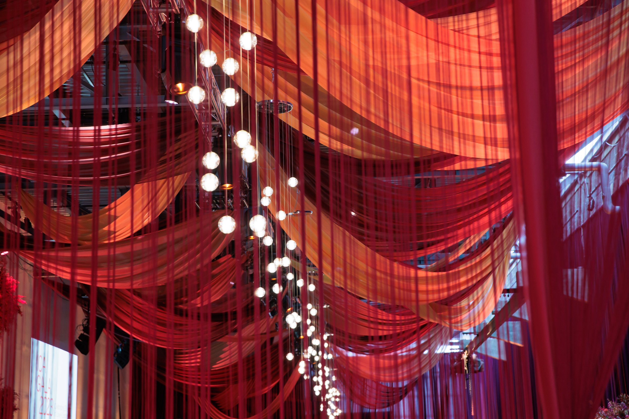
ICA Gala - Exploring Color
From the desk of: Amy Goldberg
Sometimes, an event planner’s wishes do come true! You are actually presented with a completely bare white, rectangular space, clear of any visual obstructions like columns, poles, windows or artwork and with ceiling heights of nearly 30’. Clear from trying to divert attention away from “offensively patterned” carpeting and airwalls and with several days to create a masterpiece for your client. The world is your oyster…now go play…design…why not make a bold statement!
Let’s play with intense colors to create an impactful, visual sensation of the sun setting on the Moroccan desert. That was the color palette we were asked to work with – warm golden maize, amber, shades of purple, plum, juneberry and aubergine.
Left photo was a sample image and the right photo is what we created!
Too often, with Boston’s some-what conservative and traditional design aesthetic a client is afraid to go bold for a large sort of gala and instead we dim our light and defer to something more conservative that might appeal to the majority. I say, lean in…be bold, be different, set yourself apart. There are nearly 1,000 fundraising events in Boston every single year, how will you set yourself apart while still designing an appealing space that elicits awe and delight upon entering and without alienating Boston’s more traditional eye.
Our key to success here, was to utilize the bold colors, but incorporate them into a more subtle ombre design that allowed the colors to wash over a guest’s consciousness without feeling jarring. The combination of colors could make sense when absorbing it because it focused on two neighboring quadrants on the design color wheel – not that this is something obvious that might register with an everyday guest, but that is often how a designer may think about it when looking to create an inviting space from the bare bones.
Here's just one realization of our dreams…now you go, be brave, be bold and carry on!


